How would you feel when you visit a website looking for information and it says – Loading – Please wait 10%, 50%…? Annoying? In fact nothing is more annoying for a website visitor than waiting for a 100K graphic to load when it actually has to be 10K. Huge flashy graphics and multimedia might make your website look nicer, but helps no way for a time savvy reader who comes to avail information on your site. In turn your visitor would click off immediately without looking at what you have to offer, although this is not your intention.

It is of course imperative to have a practically fast loading website so that your visitors are not left in a loop of waiting. Also remember that search engine algorithms do take your website loading time into consideration when pushing your ranking. Most likely, your visitors will come to your site for reading interesting and valuable content or to make a purchase, so why not make their visit enjoyable? Learn how to create a fast loading website with these 10 effective tips:
10 Effective Tips for a Fast-Loading Website
About Images and Graphics – We all know minimizing the usage of images can be a good deal for a fast-loading website, but what if it is not possible? Well, when designing templates, logos, buttons, and other necessary elements in Illustrator make sure they are created as vector images. As these images are big in size, turn them from CMYK to RGB and also ensure you decrease it to exact size that is required by your site. Remember resizing needs to be done only in Illustrator or Photoshop for quick loading. Make use of an excellent tool called GifBot that helps you shrinking your graphics right on a webpage quickly.
Make Most Out of CSS – CSS is a revolutionary tool for fast-loading website, actually many developers these days prefers designing the whole website using CSS. Just because it is a simple HTML code, it has an advantage of loading fast. However, working on CSS requires creativity, so make sure you try out different styles in CSS. Because CSS styles are in HTML, you would further save time and have the same unique effects you’re behind.
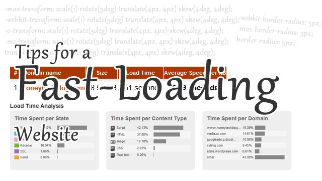
Example1: You can use CSS3 properties to give border radius instead of background images,
-moz-border-radius: 5px;
border-radius: 5px;
Avoid “So-Called” Creative Stuffs – How about adding as flash movie or a dancing object to the website to impress visitors? I’m sorry but it a bad idea, your readers would only feel assaulted with these so-called creative stuffs. Using plain Html is best as too many fancy things that impress you might bog down the loading time and will cause visual overload to your visitor. It is best to make minimal usage of such objects or even better to avoid it.
Respect Your Site Content – Placing content wherever possible will leave your reader confused and lost. Your content is valuable and the most important element of the site, so it is ok if you have more to share, but it is bad to stuff them all at one place. Basically, long content pages will take long time to load. Hence, break them into different relative sections so that the size is minimized for each page. Give some room for your reader to breathe and enjoy surfing.
Know Your Backgrounds and Buttons – Using background images will only say your website is “amateur”, because no professional site make use of background images that distract the reader. The main problem is it will take longer time to load than the usual. The same holds true in case the site has end-number of buttons. Best is to optimize your button and background in Photoshop, if the loading time really matters to you. Use appropriate web colors for background and roll over buttons to help saving loading time.
Example: You can use css for gradient properties (Tip: use colorzilla gradient editor for generating css properties online)
background: -webkit-gradient(linear, left top, left bottom, color-stop(0%,rgba(0,0,0,0.65)), color-stop(100%,rgba(0,0,0,0))); /* Chrome,Safari4+ */
background: -webkit-linear-gradient(top, rgba(0,0,0,0.65) 0%,rgba(0,0,0,0) 100%); /* Chrome10+,Safari5.1+ */
background: -o-linear-gradient(top, rgba(0,0,0,0.65) 0%,rgba(0,0,0,0) 100%); /* Opera 11.10+ */
background: -ms-linear-gradient(top, rgba(0,0,0,0.65) 0%,rgba(0,0,0,0) 100%); /* IE10+ */
background: linear-gradient(top, rgba(0,0,0,0.65) 0%,rgba(0,0,0,0) 100%); /* W3C */
filter: progid:DXImageTransform.Microsoft.gradient( startColorstr=’#a6000000′, endColorstr=’#00000000′,GradientType=0 ); /* IE6-9 */
Turn Your Images Into Tables – These days’ tables can be an excellent alternative to graphics and images. It is a must to learn to make use of tables offered by the web design program as it will reduce the load time of site. You can definitely give an artistic feel just by making use of table with background color and cool text. Remember, the more you dig down HTML to create a website, the faster you will have your website load.
Chuck Down Animated Gifs – We have increasingly saw that a simple looking website gain more popularity than animated one. Why use Animated Gifs when we know that it can slow down the loading time? There might be lot of hype about animated gifs on site, but can give horrifying results when visitors come to you. You want your visitors to come and come again, so do it with simple and fast loading website. By all means attractive design and good content can drive traffic.
Useless and Repeated Pages – Do you need them? If not, then minimize your web pages with required information and make sure you don’t duplicate them. This is very important for saving time on site navigation. Point-to-Point information is always appreciated by people. We all love manageable sites, which helps easy navigation without getting bogged down. So ensure you take away all your useless and repeated pages.
Love HTML – If you looking to save time on loading then take care you design most of your site in HTML. There is always room for creativity and the best creativity is used when designing website with HTLM code. It will not only save time, but it is relatively easy to deal with. Make use of tables, colors, CSS styles, different fonts to create it. Also know that your website should be completely error free.
Keep Your Eye Open – So your site is ready, and the work is over? No, not really, you need to keep an eye open on your website and observe the pages often. Checking often will help you locate bugs (if any) and will improve it overall. Fix the error immediately if you come across any for over all good performance!

