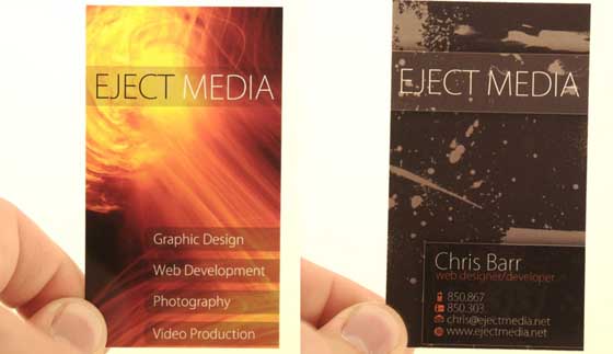
Here are the list of 5 Handy tips to design and print cards:

- Don’t forget to setup a grid for your card before printing. In the world of web designing, “Wireframes” are primarily used in setting up the card’s grid designs. For print designing necessities, graphic card designers simply use grids. The latter is usually made from refined layout content, including images and texts. Grids are deemed very complex to use yet its static columns remains flexible.
- If you’re going to include colors, images or background in your card design, prefer using a glossy paper for the printing part. The glossy paper is essential in making logos and images create a “pop” effect. The “uncoated” type of glossy paper is commonly used for printing business cards.
- Get rid of low-resolution photos. The inclusion of images highlights the card’s sophistication so you must consider the use of more advanced digital camera in capturing pictures. However, ensure the proper adjustment of your camera’s “high resolution” settings.
- Always keep your potential users in mind when designing your card before printing. Create an idyllic visualization for your target people by experimenting initial or tentative designs then figure out its productiveness when printed.
- Always be aware of your card’s totality in design and layout. Keep your design simple and fresh by not changing the color scheme. However, you have the option to change your color scheme but it must correspond well to the timeframe. Try not to come up with too “old-fashioned” designs by not relying on cheap printer ink or cartridge use
.

