 Youtube – Google team is trying is hard in making the youtube best and user friendly.They are undergoing different tests that includes changing the CSS , color schemes , logos and even the body structure in order to analyze the best performance and making more strong against another video hosting sites like metacafe , blip.tv etc.
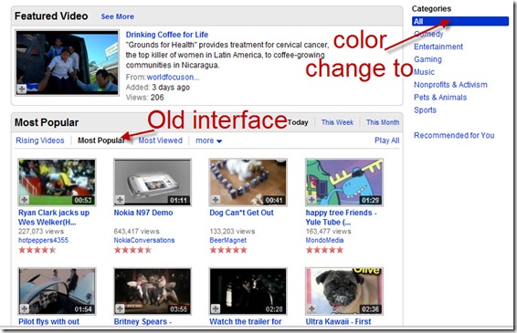
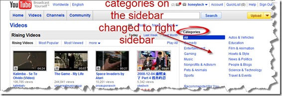
I’m noticing so many changes in the YouTube and recently i have found that the “categories” portion is shifted towards right sidebar.
More over the basic color schemes is also changes to blue and the video search option is revert back to old style (to search Video of the month, Video of the week and Top Video’s etc).


Comments
6 responses to “Changing interface of Youtube”