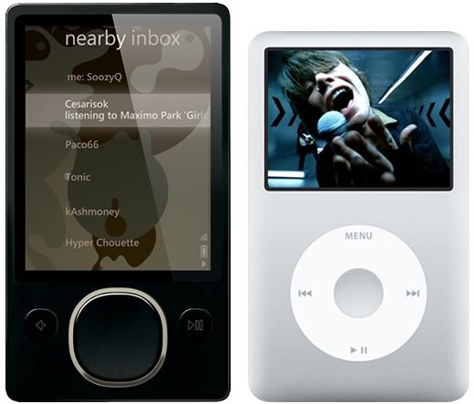
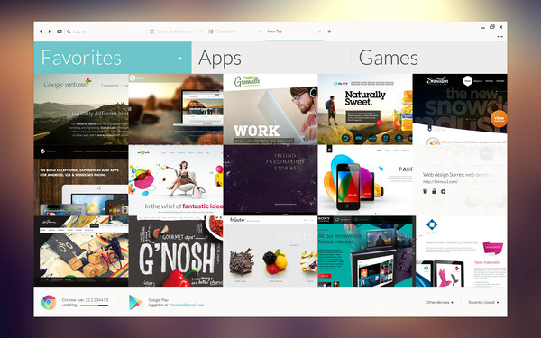
Looking back to November, 2006, we find that a product was released, that shaped the very design language of the mobile and software industry. Ironically a failed product, Zune it was called! Although as a media player Zune never tasted commercial success but the UX and UI that it sported was very radical in approach.
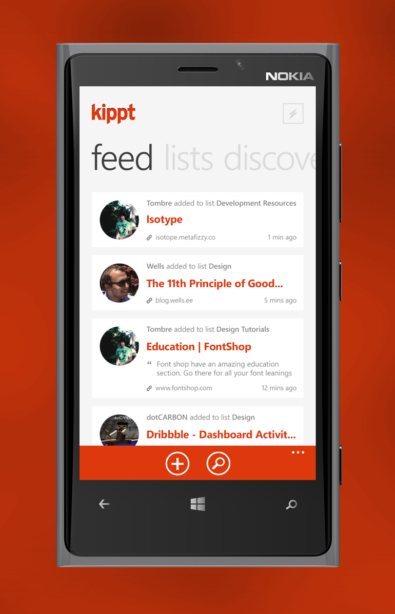
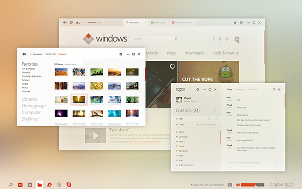
Although Zune was discontinued, the software and the various design elements are very much alive as it was probably the inspiration behind the Metro UI of Windows Phone as well as Windows 8.
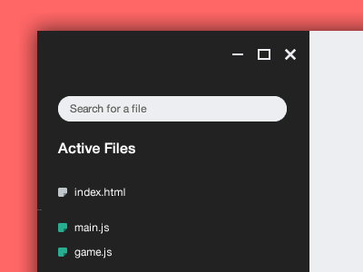
That basic flat design philosophy was soon adopted by many website designers. Whether its the design for a website or an app, flat and minimal design are fast becoming the new trend.
People are moving away from the skeuomorphism design which has been very popular over the past few years. Apple introduced it in iOS and since then many designers have adopted it.
However, with many websites and apps going cross platform, it can be tedious and time consuming creating skeuomorphic designs for multiple screen sizes and resolutions.
Flat designs on the other hand are easier to make and rest assured they look great on all screen sizes.
With most of the designers going ahead with flat design, even the mighty Apple decided to follow the flat design trend, which is quite visible from the new UI in iOS7.
Do tell us if ou are a fan of the flat design trend, in the comment section below.

