The internet has changed by measures. In just over a decade (Yes, I still think of the nineties when someone says decade!), the internet has become one of the most essential bit of our lives. Times change and consequently the design language of these websites too have changed. From those gaudy and splashy websites of yesteryear the internet has transformed to the clean and elegant designs today. Its fun to see how things have changed. Take a look at the following websites then and now in perspective.
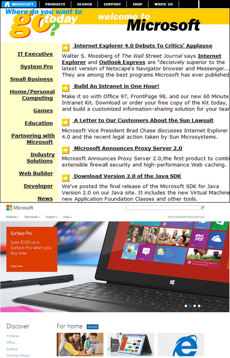
Microsoft:
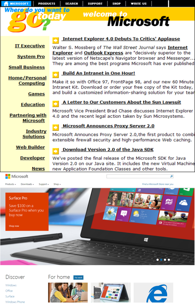
From weird color combinations to one of the best looking websites of today.
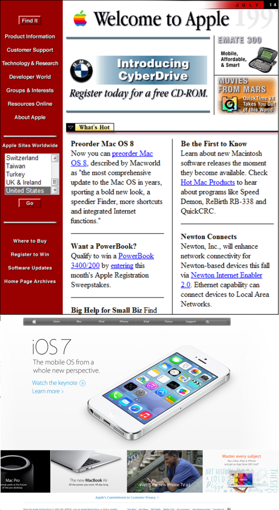
Apple:
It is incredible to see how the design of Apple computers has changed.
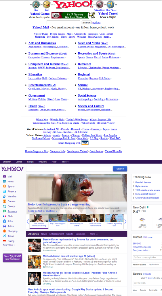
Yahoo:
Yahoo’s website was a classic example of how one pictured websites in the 90’s. Blue links with no padding and some disgusting icons.
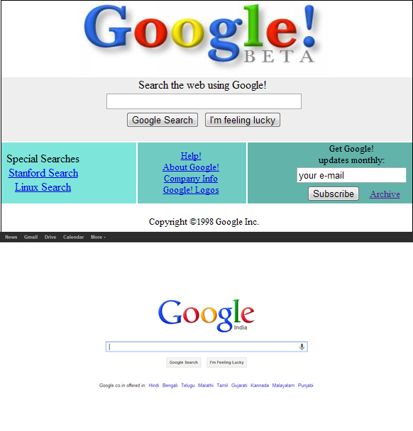
Google:
Google has always taken the minimalist approach right from the beginning.

Comments
4 responses to “How the Biggest Websites looked in 1998”