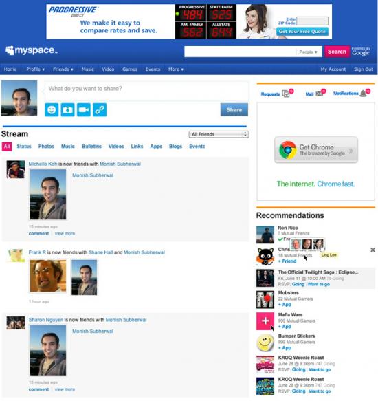
MySpace is finally putting an end to its long overdue redesign for homepage. After testing a redesigned profile page, it will now roll out a new homepage as well. The new homepage is not only lot cleaner than earlier but also does a great job for developing social network. The Stream, MySpace’s take on the Facebook NewsFeed, is middle to the homepage as it is to the profile page. It further features updates from friends and other activities. You can also filter the Stream messages to show only Photos, Links, Events and more. Then you have option to see the updates from only a part of your friends. The status update box sits on top of the Stream, enabling you to post a message, photos and videos, or share a link.
According to Mashable
The revamp, which will roll out as a “sneak peek” to some users today and to all users on August 16, is part of MySpace’s new effort to showcase its value. Christina Wodtke, General Manager of Social Networking at MySpace, told me that they have a lot of loyal users that have been with MySpace for a long time, but they haven’t really discovered all that MySpace has to offer. The new homepage is an attempt to show users, especially younger ones, what’s cool and interesting on the MySpace network.
The redesign looks to be inspired lot by the Facebook, which is however the best thing it could do. It cannot be ignored that MySpace was in need of visual redesign and so it seems like a brilliant idea to expose it now.


Comments
5 responses to “MySpace to Launch Revamped Homepage on August 16”