The number one thing web designers are doing right now is creating mobile websites. According to Luke Summerfield of Savvy Panda, there will be one mobile device for every person in the world by 2015. With 50 percent of local searches being done on mobile devices, mobile consumers are something businesses can no longer ignore. Creating a mobile website is necessary because mobile users have smaller viewing screens and different needs than consumers of the past. Sometimes an app is enough, but most people are opting for robust mobile sites.
Creating a Mobile Website
The number one thing web designers are doing right now is creating mobile websites. According to Luke Summerfield of Savvy Panda, there will be one mobile device for every person in the world by 2015. With 50 percent of local searches being done on mobile devices, mobile consumers are something businesses can no longer ignore. Creating a mobile website is necessary because mobile users have smaller viewing screens and different needs than consumers of the past. Sometimes an app is enough, but most people are opting for robust mobile sites.
Using Locked Content

Image via Imgur.com
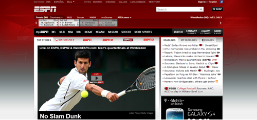
Another website design trend is to use locked content. This is when a website requires a small fee or other action before the reader can access the content. It is a strategy to increase revenue since fewer people are clicking on ads nowadays. For instance, ESPN has locked content that you can access only after purchasing a subscription to their magazine. Many people are enticed to do this because they get information that is found nowhere else on the Web.
Using Large Photo Backgrounds
In the past, web designers didn’t like to use background images because they took too long to load. However, it’s a trend right now to use them as the feature of the design. You often see a very minimalistic design used with these background images to help with load times. This website structure is common for small businesses that just want to present company information without a clunky website design. You’ll find a mix of dull colors and vibrant shades in the background image because anything goes now.
Using Social Media Badges and Buttons

Image via Flickr by Jason Howie
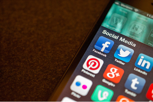
Social media is an important part of marketing, so many web designers are making it easier for people to share content through social share buttons and badges on websites. At the very least, you will find social share buttons for Twitter and Facebook, although a bar with all of them is very common.
Implementing Subscription Pop-Ups
Most websites have the goal to build a following and get repeat visitors. This leads to the website design trend of having a pop-up to encourage new reader subscriptions. It’s pretty easy to implement, and it can either pop up when the website is opened or after the reader has been on the site for a few minutes. A pop-up is much more effective at getting new subscribers than a simple link in the sidebar.
Allowing Infinite Scrolling

Image via Imgur.com
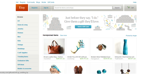
Slideshow layouts were popular for a while, but web designers found that people don’t like to keep clicking and waiting for elements to load. That led to the current trend of infinite scrolling. This essentially means that people can continue to read the website content without making several clicks. However, it’s more effective for blogs with in-text ads than businesses trying to sell things on the Internet. For instance, Etsy tried out infinite scrolling, but it led to fewer clicks and sales.
Creating an Interactive Design and Navigation
People have come to expect a box-like structure with tabs for navigation. However, it’s a trend right now to break free from those constraints. For instance, many retailers are implementing an interactive design that is more visual based than text based, such as designs with clickable images. People and businesses want an original web design to keep people interested and on the website longer. Interactive designs are proving to be very successful at this.
Using Fixed Navigation Bars
Most people get annoyed when they have to scroll back up to the top of a page to use the navigation of a website. One solution is to have a fixed navigation bar at the top of the site that always displays, even if the reader has scrolled down the page. It’s faster and more user friendly than websites of the past.
These are just a few of the web design trends happening right now. Others include a UX centered design, more flash-enabled features, SVG and responsive techniques. What trends do you think will happen in the future? Leave a comment.
About the Author
Shaun Chatman is a well published author on many authority sites. He lives in Dunedin, FL, and spends his free time playing with his kids or advising friends on everything from tech and gadgets to finance and travel.
